Immergo Labs
Redesigning Immergo Labs' marketing website to be more intuitive and speak to U.S. Army Veterans and physical therapists.
role
UX/UI Designer and Researcher
skills
Visual and Systems Design, IxD, Wireframing, User Research, UX Writing, HTML
tools
Spring ‘23 to Spring ‘24
my pt journey: part 1
P.T. AKA Pain & Torture
During COVID (dun-dun-dun), my physical therapy sessions went virtual, and it was a mess. Trying to do shoulder exercises while hanging off my bed in my cramped room, I felt lost and unmotivated. Without understanding why I was doing these movements or how they helped, PT became just another frustrating checkbox in my day.
my pt journey: part 2
How The Algorithm Saved My Life
Everything changed when I discovered Ben Patrick ("KneesOverToesGuy") on Instagram. His content was transparent and empathetic—focusing on understanding your body, accepting injuries, and making exercises accessible to everyone regardless of fitness level or equipment. Similarly, Immergo Labs' VR platform shares this mission of making physical therapy accessible and enjoyable through virtual reality technology.
my pt journey: part 3
When Life Comes Full Circle
My journey from PT skeptic to movement enthusiast perfectly prepared me for my role at Immergo. Putting myself in the perspective of my users, but also myself during Covid, I redesigned the Immergo website to be engaging, informative, and clear. Every design decision was made to help users see just how dedicated Immergo was to patient care and therapy facilitation.
Immergo and pt constraints
While transformative, physical therapy is often ineffective, time-consuming, and frustrating for most patients.
Immergo is reshaping patient-therapist relationships, rebuilding trust in our bodies and providers to redefine modern healthcare. In the pursuit of a VA grant, they needed a website update that spoke to the needs of veterans, in addition to their usual user groups of therapists and traditional patients.
How might we expose the true value in physical therapy?
Looking at my primary care provider's physical therapy offerings, I quickly realized there isn't much inspiration out there, in terms of making physical therapy look appealing. Their ONE PAGE dedicated to physical therapy made it seem like an afterthought, lacking multimedia and framing it as mere pain treatment. To make therapy stick, it must be exciting and framed as empowerment, not just treatment, while educating patients on its impact.
how does this all connect?
Practitioners and patients curious about VR therapy need confidence in its benefits.
Immergo's marketing website needed redesigning to help both patients and practitioners feel assured in their decision and see how Immergo is changing the conversation on physical therapy.
Problem space
While Immergo Labs offers their platform only to PT practices, the principles of transparency still apply.
The original website's structural issues manifested in several critical pain points that directly impacted user experience and conversion potential.
- Inconsistent visual language between the VR platform and web interfaces
- Information overload that overwhelmed potential users
- Fragmented user journeys to critical features like waitlist signup and AutoDoc
- Lack of clear hierarchy in presenting complex technological concepts to healthcare professionals and patients
Solution
Optimizing the discovery of Immergo’s offerings through strategic pathways and user-centered design
The redesign tackled key business challenges by integrating the AutoDoc tool into the main site, optimizing the waitlist signup process, building trust through strategic testimonials, and a new design system that aligned with Immergo’s VR and AutoDoc platforms. We created distinct pathways for both physical therapists and patients, backing up Immergo's innovation with social proof and compelling visuals of their VR platform in action.
001
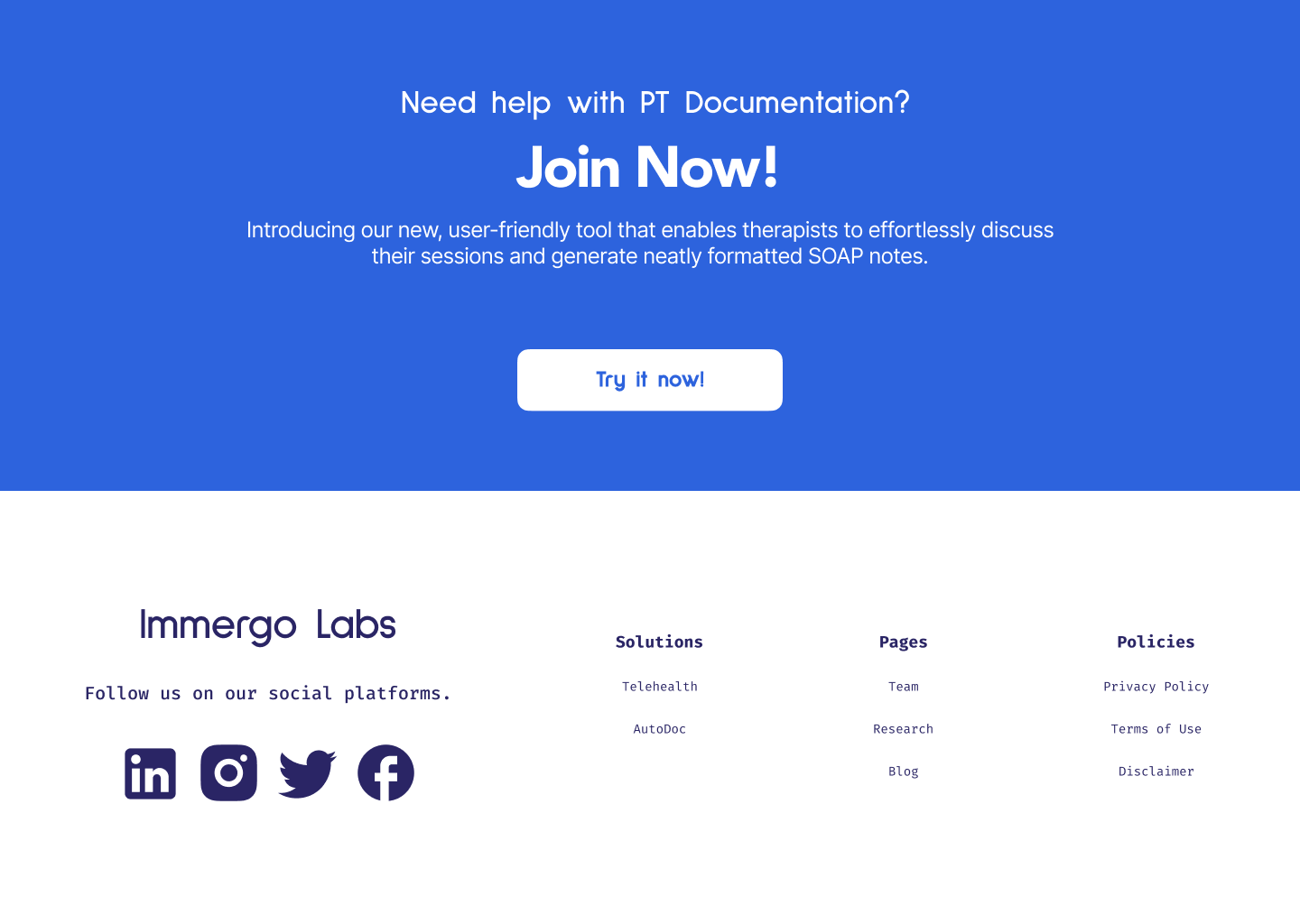
AutoDoc: Designing for accessibility and understanding
Information regarding AutoDoc , a key offering, was isolated on a separate page, creating friction in the user journey and reducing visibility within Immergo's ecosystem. Furthermore, the FAQ and feature explanations focused on benefits over technical details to avoid user confusion.
002
Optimizing waitlist conversions to decrease cognitive overload
The placement of waitlist sign-up opportunities, while abundant, suffered from poor contextual integration and visual hierarchy, often getting lost among competing elements rather than standing out at meaningful decision points.
003
Implementing testimonials to build trust and integrity
The website lacked trust signals like testimonials and visual demonstrations. While primarily targeting therapists, it neglected patient needs, creating an imbalanced experience that failed to address all stakeholder requirements.
004
Building a cohesive and modern design system
The website's design was inconsistent with Immergo's VR platform and AutoDoc tool, creating a fragmented brand experience. I improved this by redesigning the Research page, which was originally just a list of hyperlinks, with article components that matched the Blog's style. This added depth and created a more cohesive, memorable user experience.
The Blog page was well-designed but incomplete. Stakeholders wanted it to be more engaging due to low traffic. I added newsletter CTAs, a landing section featuring highlighted articles, and basic functionality (sorting, filtering)—which, though not crucial for fewer than 20 articles, enhanced user freedom.
design process: Discover
Gathering Insights
To kickstart the design process, I analyzed how telehealth companies present their offerings to diverse audiences and utilize various design elements in their marketing approaches. I then conducted a heuristic analysis of Immergo's current website, using Jakob Nielsen's 10 Usability Heuristics. Finally, I conducted some interviews of Immergo's greatest stakeholders to figure out who the website's main user segments were.
competitive analysis
To kickstart the design process, I analyzed how telehealth companies present their offerings to diverse audiences and utilize various design elements in their marketing approaches.
Heuristic evaluation
Out of Jakob Nielsen’s 10 Usability Heuristics, I found the original Immergo Website to be most deficient in its Aesthetic & Minimalist Design, and Consistency & Standards (i.e. in-button text, CTAs, use of color, etc.). I also tried to engage the rest of the 10 Heuristics through my designs, whether that meant improving the Visibility of System Status when opening up an Immergo research paper or signing up for the platform waitlist , or making the overall website safer to explore.
user interviews
After analyzing the website and identifying redesign opportunities, I interviewed Immergo's chief consulting physical therapist to assess its effectiveness and understand what would motivate therapists and patients to try Immergo's products. Based on this interview and leadership discussions, I developed user segments to guide my redesign.
woman kneeling beside man
The All-In-One
Physical Therapist & Small Business Owner
They run a hybrid clinic/gym with in-house therapists, balancing patient outcomes with efficiency and profitability. Tech-savvy but cautious, they prioritize ROI due to challenges like patient non-adherence and poor tech integration.
⚠️ Website Frustrations:
- Lack of direct answers about integration, cost, and patient adoption.
- Hard-to-find testimonials from other PTs validating its effectiveness.
💼 Needs from the Website:
- Scan key offerings fast without digging through excessive details.
- See ROI and patient benefits clearly outlined.
💡 What Works for THEM:
- Real PT testimonials and case studies.
- Straightforward breakdown of business and patient benefits.
Tired young woman using laptop in office touching head feeling headache
The Busy Patient
Marketing Executive
A newly promoted, travel-heavy parent with chronic shoulder pain struggles with therapy consistency. Tech-savvy but simplicity-driven, they prefer intuitive rehab solutions and rely on reviews before adoption.
⚠️ Website Frustrations:
- Lack of patient-centered language or relatable stories.
- Difficulty finding real user testimonials.
💼 Needs from the Website:
- Understand how Immergo VR fits into her rehab without technical jargon.
- Find patient success stories and ease-of-use assurances.
💡 What Works for THEM:
- Simple, welcoming design that is easy to navigate.
- Clear, relatable patient testimonials on ease and effectiveness.
woman wearing sheriff uniform
The Rural Veteran
Former U.S. Army Specialist, Currently on Medical Leave
Injuries limit mobility and rehab access due to distance from the VA. Moderately tech-literate, they prefer visual tools and need remote rehab to stay connected with providers while reducing travel for a smoother return to work.
⚠️ Website Frustrations:
- Walls of text instead of visual demonstrations.
- Overly complex explanations of how the tech works.
💼 Needs from the Website:
- Watch real-world examples and videos of the Immergo VR platform in action.
- Know how it connects him to a therapist without extra hassle.
💡 What Works for THEM:
- Short, direct messaging explaining Immergo VR’s impact.
- Video walkthroughs instead of lengthy descriptions.
design process: Define
Building Empathy
Discovering the different pain points was crucial in building empathy for both of the user groups our website was aimed at serving.
Unfortunately, I was not able to interview any older adults and veterans, but taking my heuristic evaluation into consideration, I set out with the task of wireframing and developing an outline for the information architecture of the website that was straightforward and took into consideration potential sentiments of anxiety around VR technology, as well as lower rates of technical knowledge and expertise.
wireframing
During my initial approach to the Immergo website redesign, I focused primarily on visual improvements. This is evident in my Lo-Fi designs shown below, where the emphasis was on clean layouts and visual hierarchy rather than trust-building elements. The Lo-Fi wireframes prioritized information architecture and aesthetic improvements, but lacked dedicated sections for testimonials or comprehensive FAQs that would later become crucial.
However, when Immergo pivoted toward pursuing VA grant funding, I recognized the need to transform our strategy. This stakeholder shift directly prompted me to leverage critical trust-building elements like testimonial sections or FAQs.
design process: develop & deliver
Designing for User Trust and Transparency
The project's goal evolved from simple beautification to establishing Immergo as a trustworthy, empathetic company serving both physical therapists and their patients—many of whom might not be tech-savvy. Our challenge became making complex technical information accessible while creating an intuitive experience for diverse users.
This strategic pivot was the catalyst that led me to incorporate trust-building components and design for accessibility and inclusion, ensuring the website could build credibility with healthcare professionals while remaining approachable for potential patients interacting with Immergo's VR system.
hi-fidelity prototyping and motion design
The redesign delivered streamlined user journeys for key actions like waitlist signups and accessing their AutoDoc SOAP note tool, while a refreshed blog section better showcased their industry expertise. My design approach balanced aesthetics with accessibility, creating an experience that felt simultaneously surreal yet simple through minimal interactions and thoughtfully applied animations as shown below.
A significant constraint was Immergo's limited multimedia assets—as a startup, they lacked the rich content typically used to establish legitimacy online. With minimal images, videos, and marketing materials available, I leveraged fundamental web design principles and subtle motion design as alternative methods to convey professionalism. This strategic use of design elements compensated for content limitations while maintaining an approachable interface.
design system
I created the Immergo Web Design system to follow the principles below to help guide me in my redesign:
- flexibility (so it can be used across the marketing site, web platform, and Autodoc)
- simple to use (& easy to implement)
- highly polished and modern
Since my co-intern, Alyssa, was working on desigining the web platform for accessing Autodoc and other Immergo products, she used many of the basic design system components in her designs (i.e. buttons, colors, logos). We worked together to define the updated color palette and typeface library.
Additionally, I had the need for website-specific components that could not be applied elsewhere in the Immergo Web ecosystem (i.e. article components, navigation bars, etc.)
Lessons learned
📝 Question assumptions early.
Blindly designing features without questioning their purpose leads to wasted effort. When I discovered the existing login functionality served no real purpose for a marketing website, it taught me to question every feature's value – even those that already exist.

During my first weeks, I spent considerable time designing user profile sections until a simple question about its purpose revealed it was outside our scope. This experience taught me that asking "why" early saves extensive redesign work later.
🎯 Simplicity serves all users.
Initially designing for tech-savvy users, I had to pivot when learning our primary audience included veterans and seniors. What seemed like a constraint became an opportunity to sharpen my UX writing.

I learned to strip away technical jargon and complex interactions, focusing instead on clear, accessible language and straightforward navigation patterns. This shift not only served our primary users better but improved the experience for everyone.
closing remarks
Thank you to my team
To Alyssa, I had a great time working with you throughout our senior year, bouncing ideas off of one another, and even doing joint interviews. Thanks for being a great co-intern! To Michael and Ash, thank you for your constant guidance and allowing me to learn and grow alongside the whole Immergo team. I wouldn’t be the designer I am today without y’all!